The Standards Manual story
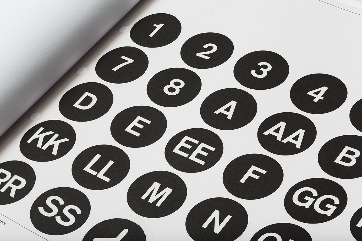
It started, as so many things do, in a basement. In this case, it was the basement at the eminent design firm Pentagram, on Fifth Avenue in Flatiron, where a mouldering graphic design artifact would become an unlikely indie publishing sensation. The book was the implementation guide for the signage of the Metropolitan Transit Authority, designed by Massimo Vignelli and Bob Noorda at Unimark in 1970 with its Swiss-style typography and memorable circular letter route designations. To the young designers who flipped through its discarded pages underneath the corporate identity design giant in twenty-first century Manhattan, it appeared as a kind of urtext, a Dead Sea Scroll of modern graphic design. Two young designers at Pentagram -- Hamish Smyth and Jesse Reed -- who both happened to work with Pentagram partner Michael Bierut, a Vignelli alumnus, felt the need to share this sunken treasure. They hastily built a website that displayed each spread of the manual, and it attracted enough attention to convince them to pursue an audacious reprint project. With the help of Kickstarter and one Alex Daly, the design imprint Standards Manual was born.
Reed and Smyth, now the proprietors of Order, a Greenpoint design practice, are also the impresarios of a shop specializing in a burgeoning field of graphic design history and education. Their Standards Manual book store sells their reproductions of vintage MTA, NASA guides — and soon that of the EPA — alongside classic texts printed by European publishers Lars Müller and Niggli. In the front room of their studio, finished in May 2017 just up the street from A/D/O, it augurs a new sense of general awareness of the graphic landscape.
Zachary Sachs of The A/D/O Journal talked to Jesse Reed about the origins of the project.
So tell me about how Standards Manual came about.
It was 2014, I think, when we found an original copy of the subway manual, in the Pentagram basement. Literally, under gym clothes, in a locker. Hamish and I thought we have to put this up somewhere. So we took it up to a conference room and jerry-rigged a camera on a tripod. We put it up on the web, and Michael Bierut tweeted it, Pentagram tweeted it, and it got a quarter of a million in unique hits in the first week.
A year later the MTA became one of our clients at Pentagram, with the WalkNYC project. Then Hamish met Alex Daly—she runs a crowd-funding management company, helping people doing Kickstarters or Indiegogos — her company plans the whole campaign with them. She planned this role: it didn’t exist.
And since we were already there, we just brought it to MTA: You know that manual from the 70s, that Vignelli manual, we have an original copy and we made a website. There might be a handful of people that would want a reissue — and then we had to explain Kickstarter. They said: Sure, you can try it. But there was a stipulation, for some official reason: you can do it for 30 days — that’s the campaign length — and so it became a limited edition. Then it blew up. It got a much larger response than we thought. We asked for — I think it was a little over $100,000, budgeted to sell 1000 books. And we ended up getting just over $800,000.
And so that became —
Yeah, seven, eight thousand books. And now we had to make it. So, here it is. This [he brings the huge original version to the table in the back of his office] is the Kickstarter version, the full-size one. We’re never going to make it again. This edition has a foreword by Michael Bierut and an essay by Christopher Bonanos, a writer for New York magazine, a historian on New York design. (Now he’s done all our essays.) Paul Shaw read it for us. The book is just scanned copies, a one-to-one ratio of every single page. We printed the PMS section in coated sheets, just like the original. It’s a 13-color book.
That’s nuts.
We didn’t have a publisher, but it wasn’t a thing where we were like: screw the system, we’re going to do it on our own. It was just that no one would have done this. But since we did it ourselves, and we had such a good response, we were able to make our dream book. Three paper stocks, 13 colors, huge. And pre-sold. We printed the amount we sold. There was no guessing. We started the Standards Manual company just because we were dealing with so much volume.
For a moment, identity guides in general seemed to be gaining renewed interest. With Unit [Editions, publisher of Manuals 1 and Manuals 2]…
Totally. It’s weird, I don’t know why it happened. In the first one, before our reprint, we sent Pentagram’s manual to Unit to photograph, which was the one they included in it. But in between, before [Manuals 1] was released, our book came out. Then there was this explosion of these kinds of books. It’s weird, isn’t it.
I feel like there’s a thing, now, about design artifacts.
Sure. For designers, we love these for pretty obvious reasons. Nerding out over all of it. But after people became aware of it, especially after the MTA one, with Kickstarter, I think the general public noticed. Before, I think a lot of people thought those were just signs. Maybe they thought the MTA just slapped them up there. But after they saw the book, they realized: Oh, this is designed. There’s this whole system. This is much more than I thought it was. I don’t think many people expected such a technical document for things they see every day.
And so did you already know what was next?
We weren’t even planning on doing a second one. But people kept asking, so a year later we did NASA. We knew of it, of course, but we didn’t really know who did it. When we emailed Richard Danne, who designed it with Bruce Blackburn, we heard back in like an hour. He was like, I’ve been waiting for your call — congratulations, I’ve been watching your work; let’s do it. He happened to be coming to New York the next week for an AIGA gala and he hand-delivered the original manual. We ended up selling over 10,000 copies. That’s still the heavy-hitter.
That was really cool because we got to work with Richard the entire way through. Unfortunately Massimo passed away a few years before we did the MTA guide, but we did work with his son Luca. He actually provided us a clean version to scan, from Massimo’s collection.
Since then we’ve done the American Bicentennial, which was also by Bruce Blackburn. If you look at the star [in the Centennial logo] it’s the same form, rotated, as the “A” in the NASA logo. And now we did the EPA. Which was by Chermayeff & Geismar [where Bruce Blackburn worked producing the Centennial manual]. And again, we got to work with them on it, and they were very involved. They’ve been awesome. It’s been a dream come true, working with Chermayeff & Geismar and like, Bruce Blackburn.
All AIGA medalists —
Yeah. We never thought this would happen. Now we’re going to start publishing other collections and bodies of work that aren’t standards manuals necessarily.
Reproductions or compilations?
I think they’re going to be more like compilations, or collections. I think the thread of preservation is what comes through. Not even necessarily graphic design. We just got picked up for distribution by DAP and ArtBook. The EPA guide will be the first official one we do with them.
Have you seen that reproduction of Telehor that Lars Muller published? It’s a magazine about Moholy-Nagy, from 1936, ring-bound, a complete facsimile.
Oh sure. Of course, we know, we’re not the first people to do this. Niggli, the Swiss publisher, they did the Josef Muller-Brockmann Grid Systems, the Armin Hofmann Graphic Design Manual, a bunch more. We have them in our bookstore. But I think it’s cool that this is all happening right now, I think the controversy is useful.
The controversy — what’s that?
Well, there’s criticism.
About the retro-ness of it?
The word “fetishization” is used a lot. But I think it’s good, the debate about reviving old work. I think there’s room for both old and new, obviously, but we still very strongly believe that these are important. I think it’s fascinating, the conversation it serves. It’s a good conversation.
A conversation about this variety of graphic design, that does seem unusual. But I’m still itching to hear what’s next.
Well, we haven’t announced them yet so we can’t say. One is related to the transit manual, but it’s not a standards manual. There’s another one that’s very tech-related, but from a very analog point in technology.
So we’re taking different directions but all of these things — the MTA manual, the EPA book — they have a very public usage, for the general population. The EPA book is one of the first examples of a flexible identity system: you have a core mark, and you have multiple divisions under one organization. Here are different colors to associate with divisions, and on top of that they provide representative patterns. “Noise,” “toxic substances.” It creates a whole visual language.
There is a reason why these are simple. It looks modern now, but the simplicity came out of necessity. They had to recreate these marks by hand, and the explanation of how to use the system that way is just as important as the design itself. The subway manual is not even an identity. It’s a signage and wayfinding program. An identity was born from the typeface and circles, but originally it was a functional, utilitarian wayfinding system.
And when you read how these are written — what needs to be said, that’s where the juicy stuff is. There’s strength in their clarity.
