Search for ‘Greg Allen’ (12 articles found)
Embroidery Trouble Shooting Guide
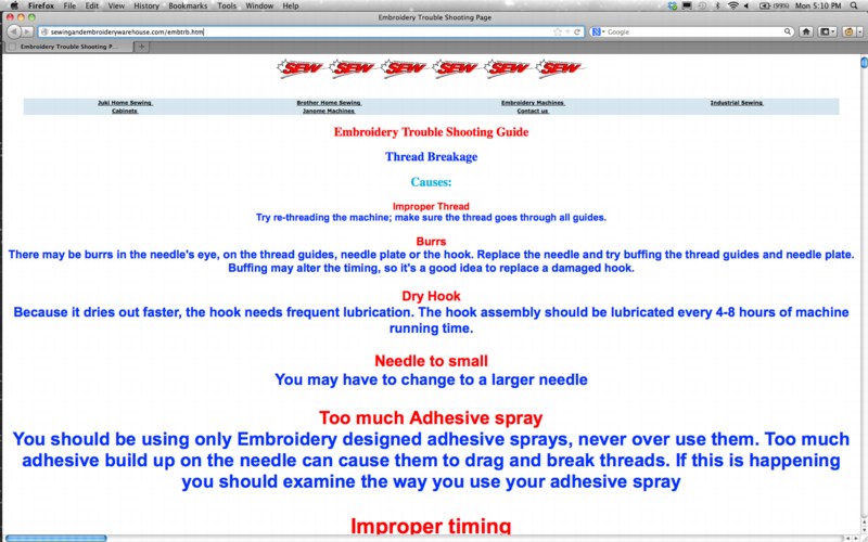
When I first met Richard Serra in 1994 or so, we talked a lot about the Internet. Soon after, I began trying to imagine what a Richard Serra web project would look like. Given the way his sculptures rather definitively reconfigured the space they inhabited, I envisioned a Serra site as a single, massive, interlaced GIF, that rendered in your browser with excruciating, megalithic slowness, controlling time and processing power as well as screenspace.
I mention this now because I think that, after my nearly 20 years online, the Embroidery Trouble Shooting Guide page at sewingandembroiderywarehouse.com comes closest to Serra’s work in terms of its spare, dauntless power.
ETSG is created in Microsoft FrontPage. None of the HTML headings tags are closed, so the text, as Rob at boingboing puts it, grows “inexorably in size until the greatest website in the world is achieved…”
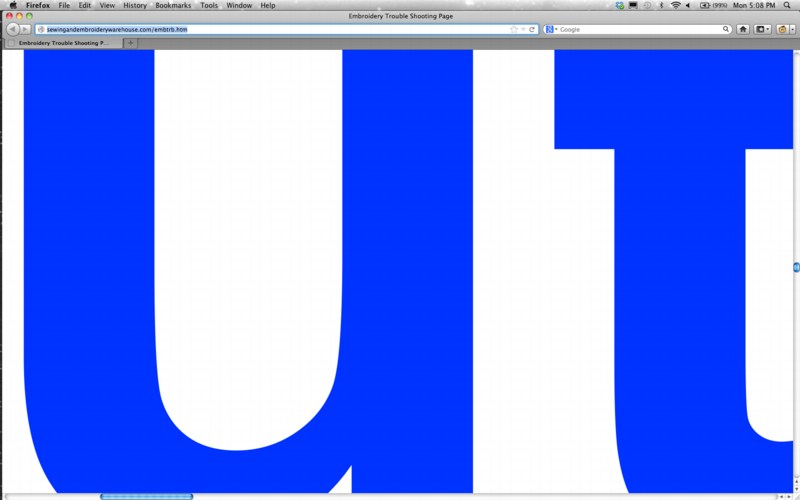
But of course, it’s all unintentional, even unnoticed. Apparently, the SEW folks say the page renders just fine in Internet Explorer.
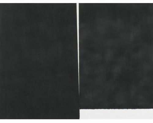
'Study For A Fence And A Wall,' 2006
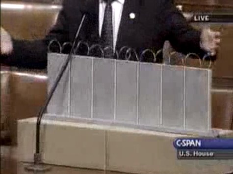
On July 11, 2006, on the floor of the US House of Representatives, Congressman Steve King, Republican from Iowa, presented a model of “a fence and a wall” he had designed. It was a site-specific proposal, to be located on the US-Mexico border.
The fence/wall could be built, Mr. King explained, using a slipform machine to lay a concrete foundation in a 5-foot deep trench cut into the desert floor, a gesture that immediately brings to mind the Earth Art interventions of Michael Heizer. Pre-cast concrete panels, Post-minimalist readymades 10 feet wide and 13 feet high, could be dropped in with a crane.
“Our little construction company,” Mr. King said, referring to the King Construction Company, which he founded, and which was then being run by his son, “could build a mile a day of this, once you got the system going.”
Mr. King demonstrated the construction of the wall using his tabletop model, made of cardboard boxes, silver-painted wood slats, and a couple of feet of coiled wire [representing the wall’s crown of concertina wire, which would be electrified “with the kind of current that would not kill somebody…we do that with livestock all the time.”]
It’s true that the remarkable simplicity of the design and the economy of the materials resonate the work of Richard Tuttle. But in the scale and especially the form, King seems to be making a conscious reference to the early work of Anne Truitt…
Much like Christo and Jeanne-Claude, King conceived of his site-specific fence/wall to be temporary, at least conceptually:
You could take it back down. If somehow they got their economy working and got their laws working in Mexico we could pull this back out just as easy as we could put it in. We could open it up again or we could open it up and let livestock run through there, whatever we choose.
Whatever we choose. Thus the fence/wall becomes a symbol of American freedom.
According to the Congressional Record, Mr. King, appearing as an expert witness, exhibited his Study For A Fence And A Wall again a week later, in a joint hearing of the House Committees of Homeland Security and Government Reform.
The current whereabouts of King’s model is not immediately clear, but I guess I could call about it. Meanwhile, I would love to see this work realized at full scale, if only temporarily, where it was conceived: right here in Washington DC. Perhaps in the National Gallery’s sculpture garden, or along one of the sleepier sections of Pennsylvania Avenue.
Stories from the New Aesthetic

James Bridle is fond of a satellite photograph of the border between Namibia and South Africa — in the middle of a desert, alongside the Orange River, there are two blocks of shimmering green pixels. They’re actually very tidy rectangular fields, but Bridle holds that, to today’s eyes, its difficult to see this gridded pattern of monochrome shades as anything other than pixels.
This variety of paradox was at the center of “Stories From The New Aesthetic,” the penultimate discussion in a series put on by Rhizome, at the New Museum.
The three speakers — Aaron Straup Cope, of the Cooper-Hewitt; Joanne McNeil, editor of Rhizome; and Bridle, the writer who coined “the New Aesthetic“ (but is quick to point out that he’s not proud of the phrase) — spoke of their increasing awareness of, and developing attitudes about, the integration of technology and everyday life. Specifically, the way they begin to behave when they overlap or reflect each other.
The fact that satellite imagery and fairly precise GPS location is readily available for anyone with a new phone might be commonplace, but the scale of that realization, both in terms of its global ubiquity and the complexity of the necessary support system becomes dumbfounding in even a larger historical frame. Only a few decades ago, the nuclear-powered submarines of the two most heavily invested militaries the world has ever known could not target ballistic missiles acceptably because, on a basic level, the submarines couldn’t even tell exactly where they were.
The now-continuous intersection between the physical world and its computer representations was the starting point for the three highly caffeinated imaginations on display at the New Museum. Cope, previously a geolocation engineer at Flickr, dilated on the echoes of reality and its schematic representation: reflections piling upon each other, and sets of overlapping data becoming increasingly rife with meaning — intended and otherwise. The complexity of possible interpretations led to a comparision of the eery oscillations of elevator statistical recordings and undersea whale calls. In such cases, the mapping of patterns against each other can often go awry. When this happens on the machine side, the feedback loops and glitches generated can seem to offer new worlds to human perception.
Bridle was struck by a list of the most productive editors on Wikipedia — presently the human race’s most exhaustive single reference resource — in which the majority were, in fact, robots. Especially in the most frequently-used networked interfaces, the pattern-matching of machines in bits of software appears to intimately interpenetrate with our own forms of recognition. The slippage between the two can be powerfully disorienting as well: in Bridle’s project Where The Fuck Was I? he unlocked his iPhone’s logged GPS data, which had traced his location in a kind of geographical diary for the previous year. But, as he explained in the discussion, he noticed later that there were places logged that he couldn’t have been — hovering above the Thames, perhaps — that were rather the product of phone’s heuristic means of locating itself:
It’s finding itself according to a whole network that we can’t really perceive. This is an atlas made by robots that is not just about physical space, but is about frequencies in the air and the vagaries of the GPS system. It’s an entirely different way of seeing space.
Joanne McNeil approached the mysteries of robot vision from the opposite direction: she observed that Google Maps’ anonymized faces are animated by their ambiguity, their strangeness heightened by their appearance in frozen, starkly exposed physical spaces. A similar kind of imposed narrative arose from Apple’s recent map update, in which its warped topology gave birth to structures and locations that seem to melt into puddles or crawl in jagged zig-zags across a plane. While these errors can be looked at solely as hazards for navigation, McNeil argued they can also be seen as seams through which the narrative of the human “way of seeing” compares to a machine’s.
There is such a preponderance of the “beauty of glitches” in talk of the New Aesthetic that it’s easy to start to think that’s simply what the phrase refers to. But it seemed to me the range of examples is not so easily circumscribed. Similar projects like Jon Rafman’s 9 Eyes — a collection of wide-angle images snapped in Google Street View — tend to be driven by what Henri Cartier-Bresson called “decisive moments.” On occasion they come from the distorions of space or color that affect the Google camera at critical angles, but mostly they are moments frozen in an instant of heightened significance: a nude standing by the shore, a band of wild horses glimpsed behind ancient gravestones. Their beauty arises almost entirely from the strictly human elements of their contents.
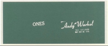
The term might seem to better suit Greg Allen’s reprinting of “Wohlgemeynte Gedanken über den Dannemarks-Gesundbrunnen”, in which a 2008 Google Books scan rendered an 18th-century treatise on “hydrologie” into impressively flowing and rippling typographical landscapes. Released as an eBook, Allen’s piece navigates a turbulent space between printed matter and digital representation, from the accident as an artistic origin and the unknowable logic of a failing optical scanner. But again, its force derives from the reflexivity of its maker, and the object’s pose within established codes of art-making and visual beauty.
The talk surrounding The New Aesthetic urged some further level of comprehension or intermeshing of human and machine modes of understanding. (At times during the talk, I felt alone in my doubt about whether present-day machines can be said to “understand” in any sense that retains the word’s meaning.) If the New Aesthetic is to metabolize the kinds of refraction and layering between codes and languages — or ways of seeing — it seemed to me its examples ought to emerge not from happy coincidence, but rather from the explicit, perhaps eery, echoes between different worlds.
What seemed to go unsaid, or perhaps was implicitly rejected, was the established complaint about the portal of representative technology, first made by philosophers like Jean Baudrillard and Umberto Eco, for whom representation and distancing were forms of impoverishing “the real.” A new form of this disappointment was expressed by the anthropologist David Graeber in a recent essay for The Baffler:
The technologies that have advanced since the seventies are mainly either medical technologies or information technologies — largely, technologies of simulation (…) the only breakthroughs were those that made it easier to create, transfer, and rearrange virtual projections of things that either already existed, or, we came to realize, never would (…) The postmodern moment was a desperate way to take what could otherwise only be felt as a bitter disappointment and to dress it up as something epochal, exciting, and new.
The most profound suggestion behind all the various limbs of the New Aesthetic is that something new can be found not just in linear progress through “the real” (which perhaps might be better put as simply “the material”). It might be found, instead, in the strange undertones in the resonance between the way a representation is automatically generated and the way we have come to think of it in the complacency of our ordinary material existence.
That point of intersection — between representation and reality — is, after all, where art has always found meaning. Bridle stressed that, to truly understand that hall of mirrors as it exists today, we must search these systems for the keys to unlock them from the inside, before they will be comprehensible, first we must “find the right metaphors.” Though Theodor Adorno may well have been dismayed at these prospects, I think one of his instructions remains apt: “Teach the petrified forms how to dance by singing them their own song.”
On 'Cancelled...' at the Center for Book Arts
THE CENTER FOR BOOK ARTS
28 W 27th Street, 3rd Floor
April 18–June 30

View of “Canceled: Alternative Manifestations and Productive Failures,” 2012.
Richard Prince v. Patrick Cariou, a fair-use case currently in appeals, threatens to set a dangerous precedent for the legality of appropriation. The initial ruling against Prince in 2011 included—in a surprisingly draconian injunction—an order that the works be destroyed or never displayed publicly. Cases like this can make an artwork seem considerably less interesting than the machinery of art and institutions that revolve around it. Greg Allen’s YES RASTA, 2011, a deadpan bound volume that reproduces depositions in the case, is one of the sixteen quasi-documentary, quasi-performative works on display in “Canceled.” The exhibition courses through several decades of art’s challenges to censorship, from the Los Angeles Police Department’s late-1950s persecution of Wallace Berman’s work and exhibition (“pornography”), to the imploding of Manifesta 6 in 2006 (Cypriot politics), to David Wojnarowicz’s recent expulsion from the Smithsonian’s “Hide/Seek” exhibition (an “assault on the sensibilities of Christians”).
Some remarkable artifacts come to the surface in this extensive trawling: a one-of-a-kind collaged mailer from the artist Cameron to Berman; Hans Haacke’s personal copy of his monograph Werkmonographie, which documents his inspired struggle with the Guggenheim in 1971. (The muscular neutrality of Haacke’s work made him seem a particularly stylish David wielding nothing more than Concept against Goliath’s vested interests. Here you can find the best joke, from the Guggenheim’s rejection letter to Haacke: “The trustees have established policies that exclude active engagement toward political and social ends.”)
At times the curatorial conceit can be a bit baggy: Seth Siegelaub’s books-as-exhibitions from the 1960s are a form of rejecting the gallery’s physical space, but they have little rapport with the conflict that animates most of the other selections. The curator, Lauren van Haaften-Schick, suggests in an accompanying essay that that the exclusion of contested artworks from exhibitions represents “ultimately productive failure,” which reminded me of the chestnut “fail better” from Samuel Beckett’s last novel, Worstward Ho (1983). Beckett was fairly black about about one’s prospects in the end (hence that title)—“Canceled” leaves one with a much more generous feeling about the possibility of failure.
How Ya Like Me Now?
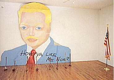
How Ya Like Me Now?, a large painting of a white Jesse Jackson by David Hammons, was one of seven outdoor works in “The Blues Aesthetic: Black Culture and Modernism,” an ambitious exhibition organized in the Fall of 1989 by Richard Powell at the Washington Project for the Arts.
The other six outdoor artworks were installed without a hitch, but approval for Hammons’ painting to be erected on a DC city-owned parking lot dragged on for six months, three months after the show opened. When the OK was suddenly given [with no explanation of either the delay or the decision], WPA staffers hurriedly erected How Ya Like Me Now? on the lot at 7th & G Streets [where the Verizon Center currently sits], across the street from one of the intended target audiences for its questioning title, the National Portrait Gallery.
The NPG had no portraits of blacks on display at the time. And Hammons suggested that a portrait of Jackson, arguably the most prominent African American in the US in 1988, would already be in the museum if he’d been white. Jackson had lost the Democratic Party’s nomination for president to Michael Dukakis after hitting a wall of white voter resistance in Wisconsin, a phenomenon of racist reluctance pundits called “the Bradley Effect.”
But a billboard-size portrait of a pink-cheeked Jackson suddenly appearing on the streets of DC with no explanation and a Kool Mo Dee lyric for a title was bound to arouse controversy. And when WPA curator Powell, who is black, left three white staffers to finish installing the piece, a crowd of young black men formed, voiced their protest against the artwork—and then took a sledgehammer to it and tore it down.
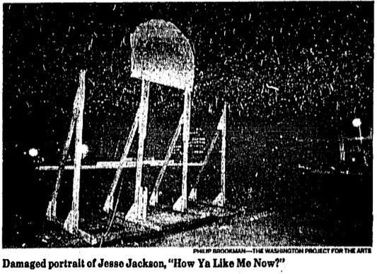
The Washington Post showed a photo of the only piece left standing on 7th Street, Jackson’s blonde afro and part of his blue eyes. After some back and forth in which Hammons kind of complained that the WPA did not install the work as high off the ground as had originally been called for, and the WPA complained about the city’s footdragging delays and said it was going to send the scalped Jackson back to Hammons for repair, the damaged tin painting when back on view, encircled by hammers, for the remainder of the exhibition.
All of which makes me very interested to know when and how How Ya Like Me Know? ended up in its current home in a private DC collection.
'Guggenheim Color' by Fine Paints of Europe (of Woodstock, VT)
The Guggenheim Museum, in “an exclusive licensing arrangement with Fine Paints of Europe, Inc. of Woodstock, Vermont, will introduce two paint collections suitable for residential and commercial use in October 2011.” The “second collection” Meyerhoff refers to above, in a video intro which I transcribed from the website for Guggenheim Color by Fine Paints of Europe, is Classical Colors, “a set of 150 wall colors drawn from much-loved paintings in the Guggenheim’s permanent collection.”
Beyond the concept itself, which is obviously golden—no, wait, it’s conceptually golden precisely because of the art that was chosen, why it was chosen, and how it is being packaged and presented.
Cezanne, van Gogh, Delaunay, de Chirico, Kandinsky, Modigiliani, Gaugin, Pissarro, Franz Marc, whose Stables provides the illustrative detail above. I suspect these artists’ primary commonalities—besides their “very rich, soft, elegant, classic palette,” are being in the Guggenheim’s collection and being dead long enough for any copyright and trademark claims to evaporate.
What makes the Guggenheim Color Collections superior to run-of-the-mill museum merchandise is that it’s actually paint, the stuff the art is made of. Or at least that’s what it’s meant to evoke. Great word, evoke. There’s ample scholarship and conservation data, dissertations and grant-funded research projects galore, on what paints artists actually used. Technology exists to analyze the paint’s spectral and chemical properties with great precision and match it to historical manufacturing information.
None of that seems to have been brought to bear here. In addition to Fine Paints of Europe’s “unique tinting system,” the Collection was “refined.” “Refined in consultation with exhibition designers to ensure the colors are appropriate for a variety of architectural settings.” and “further refined” and “fine-tuned” for a variety of “lighting situations, to precisely match each hue.” These are not recreations, but evocations, and each color “relates to the painting from which it was derived and the artist who created it.”
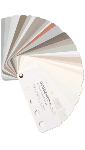
This is distinct from other collection, Gallery Colors, which is—students of The White Cube, rejoice!—actually based on the Guggenheim’s archives of wall paints used in the galleries “by generations of Guggenheim Museum curators, artists, and designers-including Wright himself.” And Jean Nouvel. Up in the middle of the fan there is the charcoal-black he used in the Rotunda for the Brazil exhibit. “These fifty hues,” FPE’s website says, “are intended to guide homeowners and designers in the presentation of art.”
Guide on, Fine Paints of Europe, and art will follow.
Previous Fine Paints of Europe coverage on greg.org, because hello, it’s an officially licensed manufacturer of Pantone Matching System paints: Rijksoverheid Rood
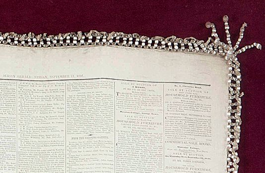
Queen Victoria silk newspaper
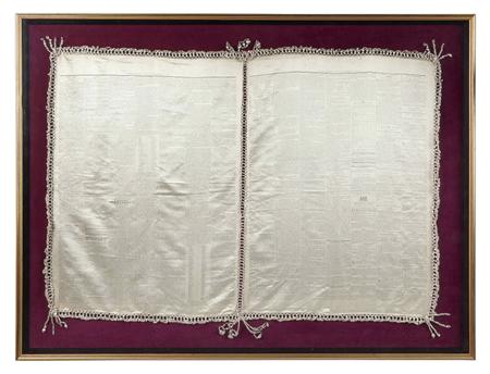
Apparently, to commemorate Her Majesty the Queen’s to the Isle of Jersey, The Jersey Herald printed copies of the September 11, 1846 edition of the newspaper on silk panels, which were then stitched together with beaded pearls. Here’s a detail shot:
ArtCash
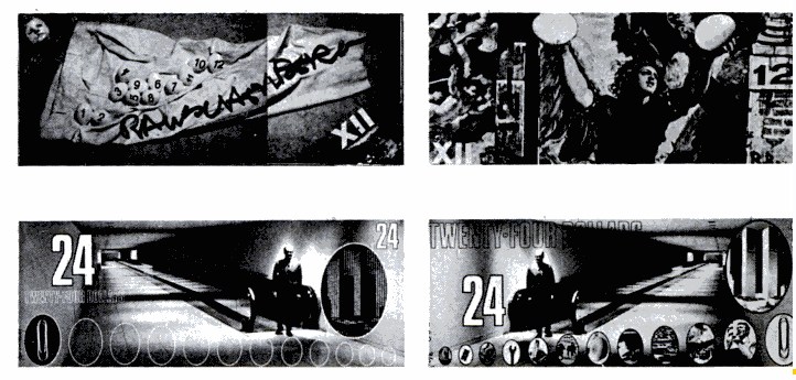
ArtCash by Rauschenberg (top) and Tom Gormley, via nymag
p>Whatever else it was, Billy Kluver, Bob Rauschenberg and Robert Whitman's Experiments in Art & Technology was wildly successful at never selling out; the collaborative was constantly broke and getting bailed out by whomever they could find. E.A.T. was booted from the Pepsi Pavilion at Expo70 as soon as it opened over wild cost overruns. I saw a thick folder of invoices, IOUs, and pleas for petty cash in the Castelli Archives. I hear there's an identical stack, probably even thicker, in the Foundation for Contemporary Arts. And then the other night, I find this 1971 article about art and money in [where else?] New York Magazine:In the sixties several American artists, most notably Larry Rivers and Andy Warhol, used money as the subject of their paintings. Calling on their example, a broke E.A.T. organized a gambling event last week to finance further activities. Currency was designed by Warhol, Robert Whitman, Robert Rauschenberg, Red Grooms and Marisol [and Tom Gormley], on an escalating scale. But Swedish artist Oyvind Fahlstrom’s design was turned down for political reasons—it depicted Nixon inflating and deflating himself…Their gambling night was an amusing comment on the current situation as well as, hopefully, a way to outflank the museum-bank gallery-cartel syndrome.
The gambling night was held at Automation House on the Upper East Side, the head end of one of Manhattan's first cable TV companies. Proceeds were actually flagged for E.A.T.'s Community Television Center and Artists & Television. $25 got you $25 ArtCash bucks, which you could use to win "TV sets and original graphics."
Weight, Weight, Don't Tell Me
On October 4th, 1994, at an artist panel discussion for MoMA’s Cy Twombly retrospective, Richard Serra made an offhand comment about how “The last century of art has been based on a misreading of Cezanne.”
To a young, impressionable student/fanboi still putting his contemporary art world view together, this was a shock. Because it was Serra, and because I still assumed there was some right art historical “answer” to be gotten to, and because Serra didn’t bother to say how everybody got it wrong, it lodged in my brain for years.
And so it was that at some point a couple of years later, when I met him at a party, I asked him what he’d meant. Of course, he didn’t remember what he’d said, or the context, so he gamely tried to float a couple of possible theories, but nothing that matched the seeming conviction with which I’d remembered him saying it. So I tried to forget about it.
And I thought I had, at least until just now, when I was reading Serra’s discussion with Gary Garrels in the Richard Serra: Drawing catalogue. They were talking about the “jump” in Serra’s work after 1989 in terms of Cezanne:
GG: Those double-panel drawings, rather than dealing with a wall or with a room or a space, deal with internal relationships.
RS: They are masses in relation to one another. They’re not about composition or figure-ground; they emphasize the comparison of different weights in juxtaposition.
GG: So this, to me, is again another jump.
RS: For me they have more to do with Cezanne than with Malevich. I wasn’t looking at Cezanne when I conceived them, but in retrospect, I see a clear connection in the way they deal with weight and mass in relation to shape. They’re the opposite of the floating shapes of Constructivism and Malevich, referred to in drawings like Heir
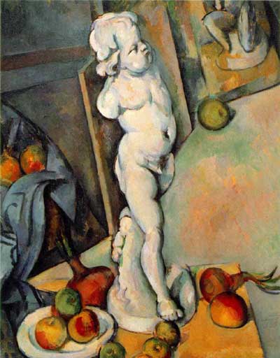
The comparison of the diptychs with Cezanne may be a stretch, but no one else comes to mind who deals so physically with mass and weight. No one talks about the weight of Cezanne, but there’s a manifestation of weight there that’s not in Picasso, not in Matisse, barely in anyone who follows. Cezanne is obviously interested in gravity and in the relation of weight to plane. Take Still Life with Plaster Cupid [ca. 1894], in the Courtauld, where he punches a hole in the space, and you think the apples and onions are going to roll off the table. The only thing holding them in place is their weight. They have the weight of cannonballs.So the answer, then, is C) gravity.
But then, literally, as I’m typing this in from the book, it’s 41:00 into the recording of the panel, right where Serra says it:
I think Twombly has a big range— a big range of evocation. I think that’s what he does. He doesn’t present an image; he evokes a sensuality, and it’s unlike anything in post—I think. I’d have to go back to someone like Baziotes, maybe—there’s nothing in the American brain like that. Americans are much—maybe Brice. Americans are much more heavy-handed, much more flat-footed, much more aggressive.
This is the opposite of Cezanne. And the whole inheritance of the New York School kind of goes Cezanne; Cubism; into Abstract Expressionism; Pop Art pretty much hangs things back on a grid; the grid comes back up again in Minimalism. That seems to me all an extension of a certain kind of classicisim and aggression and a standardization coming out of Cezanne, a misreading of Cezanne, albeit. And Twombly takes the opposite attack. It’s very lyrical. And very open. And very…delicate.
Brice Marden: Yeah, I think it’s really great that he left town. [crowd laughs]OK, then. I seem to have misunderstood the question. The correct answer is actually D) Serra likes to think in terms of major historical frameworks. I’m glad that’s all cleared up.
'Frame is part of drawing'
How do we know what we know, and when?
For instance, we know that Erased de Kooning Drawing (1953) is one of Robert Rauschenberg’s most important, influential works. It’s the kind of commonly accepted history that lands a piece in the Final Four of Tyler Green’s Art Madness poll to determine America’s Greatest Post-War Artwork.
And we know the story of it, how Bob took a bottle of liquor with him to Bill’s studio to ask for a drawing to erase. And how Bill, at first reluctant, twice-validated the sacrifice by giving away “a drawing he’d miss” and which would be “hard” for Bob to erase. And then Bob signed it and framed it and sparked an art world scandal with it which hasn’t really abated. We know this because Bob and then his curator and critic advocates repeat the story so frequently. [Vincent Katz has a nice telling of it in Tate Magazine in Autumn 2006.]
But this weekend, I suddenly had cause to wonder just how all this went down, and when, really, did this revolution start? Because it’s not as clear or as obvious as I had always assumed.
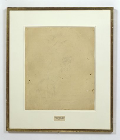
That’s Erased de Kooning Drawing up there, precisely matted and framed. That’s how I saw it for the first time in Walter Hopps’ “Rauschenberg In The Early 1950s” show at the Menil 20 years ago, and then again in John Cage’s “Rolywholyover” a couple of years after that. [Or am I conflating the two Guggenheim SoHo versions of those shows?]
At the time, it was still in the artist’s own collection. In 1998, SFMOMA acquired it along with a group of other Rauschenberg works. [Calvin Tomkins wrote in the New Yorker in 2005 that MoMA was offered the works first and turned them down.] Its official description: “drawing | traces of ink and crayon on paper, mat, label, and gilded frame.” It’s not just a drawing, not just an erased drawing, it’s an object assembled.
SFMOMA has a nice little, c.2000 interactive that includes the back of the piece:
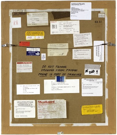
“DO NOT REMOVE
DRAWING FROM FRAME
FRAME IS PART OF DRAWING“
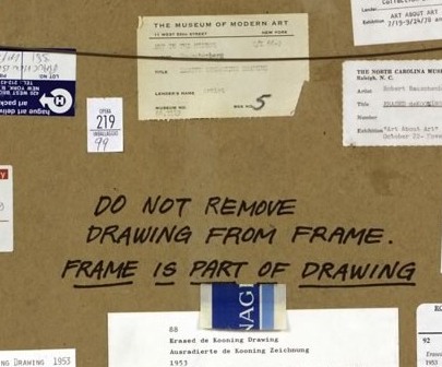
LOVE THAT. I could geek out staring at the backs of artworks all day. Did Bob himself write that? It looks like it.
The early line on Erased de Kooning was either “neo-dada,” which was a standard critical reaction to Rauschenberg in the 50s, or AbEx patricide. But it has since evolved far beyond these bad boy, enfant terrible readings, to be considered a precursor of huge swaths of contemporary art.
In his 2009 book, Random Order: Robert Rauschenberg and the Neo-Avant-Garde, Branden Joseph discussed Erased de Kooning Drawing as one of the touchstones of conceptual art and appropriation art, alongside Marcel Duchamp’s mustache-on-the-Mona-Lisa, L.H.O.O.Q:
Whether by defacement or effacement, the two works’ devalutaion of the appropriated representation (an essential factor in the process of allegorization) is equally effective. Rauschenberg’s subsequent mounting of the erased sheet of paper within a gold frame, together with the adition of a carefully hand-lettered label with a new authorial attribution, title, and date (“Erased de Kooning drawing / Robert Rauschenberg / 1953”), simultaneously doubles the visual text with a new signification and calls attention away from the (now depleted) visual aspect of the work and toward the conventional and institutional devices of the work’s “framing.”…For Rauschenberg’s Erased de Kooning Drawing essentially reenacted the reception of his White Paintings: the initial evacuation of expressive or representational meaning in favor of transitional, temporal forces subsequently gave way to a process in which meaning was reattributed to the work from the outside.
Indeed it was. As the White Paintings were to the reflections and shadows in the room, so Erased de Kooning Drawing was to passing theories of art.
In 1976 Bernice Rose put “the famous Erased de Kooning drawing” along side Jasper Johns’ Diver at the foundation of The Modern’s major survey, “Drawing Now.” Reviewing the show for the New Yorker, Harold Rosenberg dismissively labeled Pop, Minimalism and Conceptualism, the work that followed Rauschenberg’s and Johns’s “parodies of Action painting,” as the new “Academy of the Erased de Kooning.”
Later that year, the drawing was in Walter Hopps’ Rauschenberg Retrospective at the Smithsonian, which traveled back, in 1977, to MoMA. Where it prompted Grace Glueck to open her NY Times story with a rhetorical question—“Wasn’t it only a couple of years ago that Robert Rauschenberg erased a drawing by Willem de Kooning?”
Yes, only a couple, give or take twenty four. Maybe it just took that long to get it. We had to wait for Conceptualism to be invented before anyone could recognize Erased de Kooning was its foundation.
In the September 1982 issue of Artforum, none other than Benjamin Buchloh discussed Erased de Kooning Drawing‘s historical importance in a sprawling 14-page essay titled, “Allegorical Procedures: Appropriation and Montage in Contemporary Art”:
At the climax of the Abstract Expressionist idiom and its reign in the art world this may have been perceived as a sublimated patricidal assault by the new generations most advanced artists, but it now appears to have been one of the first examples of allegorization in post-New York School art. It can be recognized as such in its procedures of appropriation, the depletion of the confiscated image, the superimposition or doubling of a visual text by a second text, and the shift of attention and reading to the framing device. Rauschenberg’s appropriation confronts two paradigms of drawing: that of de Kooning’s denotative lines, and that of the indexical functions of the erasure. Production procedures (gesture), expression, and sign (representation) seem to have become materially and semantically congruent. Where perceptual data are withheld or removed from the traditional surface of display, the gesture of erasure shifts the focus of attention to the appropriated historical constrict on the one hand, and to the devices of framing and presentation, on the other.
Whew. But.
Back up. Because here is Buchloh’s account of the gesture, and of the “device of framing and presentation”:
After the careful execution of the erasure, which left vestiges of pencil and the imprint of the drawn lines visible as clues of visual recognizability, the drawing was framed in a gold frame. An engraved metal label attached to the frame identified the drawing as a work by Robert Rauschenberg entitled and dated 1953.
[Emphasis added because, WTF engraved metal label?] When did it have a metal label?
There wasn’t one in 1991 when I saw it. And there wasn’t one in 1976, when Walter Hopps wrote this catalogue entry: “He [Rauschenberg] then hand-lettered the title, date of the work, and his name on a label and placed the drawing in a gold-leaf frame bought specifically for it.” [Oddly, the only source Hopps cites is an Interview Magazine Q&A, dated May 1976
, just as the catalogue was being produced.]
There is no way that the hand-drawn label in the middle of the mat of Erased de Kooning Drawing could be mistaken for a metal label on a frame. At least if you had seen the work in person. Or had discussed it with anyone who had. So the implication, then, is that in 1982, Benjamin Buchloh had not actually seen Erased de Kooning Drawing, or that he’d misremembered it or misread a photo of it, and neither he nor anyone at the magazine of record noticed the error. Which does make some sense if Erased de Kooning is a conceptual work in the mode of Joseph Kosuth, not an art object, per se but an “idea of an art work [whose] formal components weren’t important.” [Of course, Kosuth said that in 1965, more than a decade after Rauschenberg apparently already demonstrated it.]
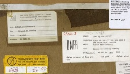
But there are some problems here. Judging by all the registrars’ labels and notes on the back, it seems impossible that someone like Benjamin Buchloh would not have seen Erased de Kooning Drawing in the 30 years since its creation. But looking more closely, I can’t find any exhibitions dating before 1973. That’s when Susan Ginsburg’s show, “3D Into 2D: Drawing For Sculpture,” opened at the New York Cultural Center. [Ginsburg was, among many other things, a board member of Change, Inc., an artist emergency assistance foundation Rauschenberg started in 1970.]
Was Erased de Kooning Drawing shown in the 60s? Or the 50s, for that matter? Where? How? What was the reaction? Because the triumphant Conceptualist historicization of the work seems to have obscured—if not actually erased—its early history.
