Search for ‘Zachary Sachs’ (5 articles found)
The Standards Manual story
It started, as so many things do, in a basement. In this case, it was the basement at the eminent design firm Pentagram, on Fifth Avenue in Flatiron, where a mouldering graphic design artifact would become an unlikely indie publishing sensation. The book was the implementation guide for the signage of the Metropolitan Transit Authority, designed by Massimo Vignelli and Bob Noorda at Unimark in 1970 with its Swiss-style typography and memorable circular letter route designations. To the young designers who flipped through its discarded pages underneath the corporate identity design giant in twenty-first century Manhattan, it appeared as a kind of urtext, a Dead Sea Scroll of modern graphic design. Two young designers at Pentagram -- Hamish Smyth and Jesse Reed -- who both happened to work with Pentagram partner Michael Bierut, a Vignelli alumnus, felt the need to share this sunken treasure. They hastily built a website that displayed each spread of the manual, and it attracted enough attention to convince them to pursue an audacious reprint project. With the help of Kickstarter and one Alex Daly, the design imprint Standards Manual was born.
Reed and Smyth, now the proprietors of Order, a Greenpoint design practice, are also the impresarios of a shop specializing in a burgeoning field of graphic design history and education. Their Standards Manual book store sells their reproductions of vintage MTA, NASA guides — and soon that of the EPA — alongside classic texts printed by European publishers Lars Müller and Niggli. In the front room of their studio, finished in May 2017 just up the street from A/D/O, it augurs a new sense of general awareness of the graphic landscape.
Zachary Sachs of The A/D/O Journal talked to Jesse Reed about the origins of the project.
So tell me about how Standards Manual came about.
It was 2014, I think, when we found an original copy of the subway manual, in the Pentagram basement. Literally, under gym clothes, in a locker. Hamish and I thought we have to put this up somewhere. So we took it up to a conference room and jerry-rigged a camera on a tripod. We put it up on the web, and Michael Bierut tweeted it, Pentagram tweeted it, and it got a quarter of a million in unique hits in the first week.
A year later the MTA became one of our clients at Pentagram, with the WalkNYC project. Then Hamish met Alex Daly—she runs a crowd-funding management company, helping people doing Kickstarters or Indiegogos — her company plans the whole campaign with them. She planned this role: it didn’t exist.
And since we were already there, we just brought it to MTA: You know that manual from the 70s, that Vignelli manual, we have an original copy and we made a website. There might be a handful of people that would want a reissue — and then we had to explain Kickstarter. They said: Sure, you can try it. But there was a stipulation, for some official reason: you can do it for 30 days — that’s the campaign length — and so it became a limited edition. Then it blew up. It got a much larger response than we thought. We asked for — I think it was a little over $100,000, budgeted to sell 1000 books. And we ended up getting just over $800,000.
And so that became —
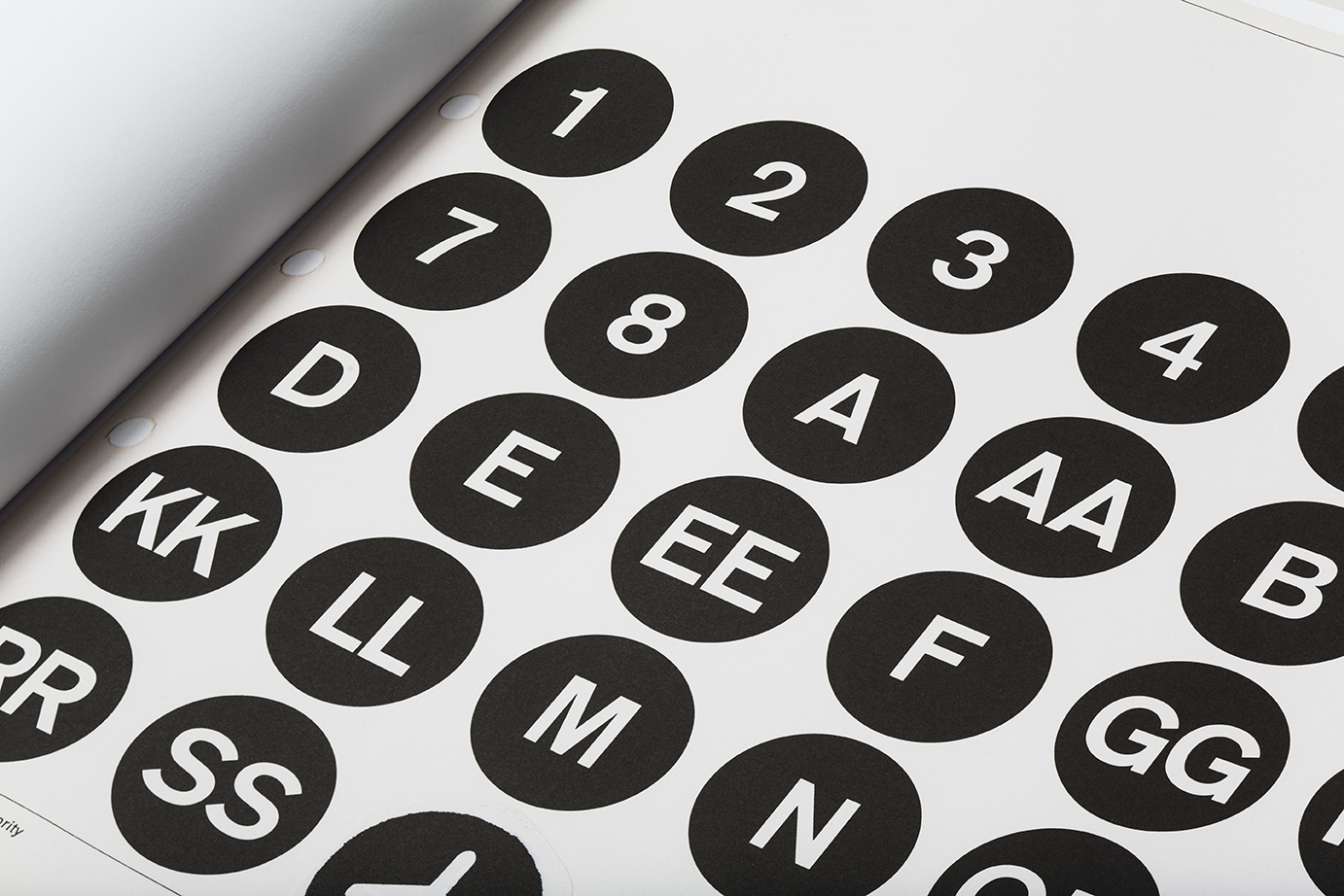
Yeah, seven, eight thousand books. And now we had to make it. So, here it is. This [he brings the huge original version to the table in the back of his office] is the Kickstarter version, the full-size one. We’re never going to make it again. This edition has a foreword by Michael Bierut and an essay by Christopher Bonanos, a writer for New York magazine, a historian on New York design. (Now he’s done all our essays.) Paul Shaw read it for us. The book is just scanned copies, a one-to-one ratio of every single page. We printed the PMS section in coated sheets, just like the original. It’s a 13-color book.
That’s nuts.
We didn’t have a publisher, but it wasn’t a thing where we were like: screw the system, we’re going to do it on our own. It was just that no one would have done this. But since we did it ourselves, and we had such a good response, we were able to make our dream book. Three paper stocks, 13 colors, huge. And pre-sold. We printed the amount we sold. There was no guessing. We started the Standards Manual company just because we were dealing with so much volume.
For a moment, identity guides in general seemed to be gaining renewed interest. With Unit [Editions, publisher of Manuals 1 and Manuals 2]…
Totally. It’s weird, I don’t know why it happened. In the first one, before our reprint, we sent Pentagram’s manual to Unit to photograph, which was the one they included in it. But in between, before [Manuals 1] was released, our book came out. Then there was this explosion of these kinds of books. It’s weird, isn’t it.
I feel like there’s a thing, now, about design artifacts.
Sure. For designers, we love these for pretty obvious reasons. Nerding out over all of it. But after people became aware of it, especially after the MTA one, with Kickstarter, I think the general public noticed. Before, I think a lot of people thought those were just signs. Maybe they thought the MTA just slapped them up there. But after they saw the book, they realized: Oh, this is designed. There’s this whole system. This is much more than I thought it was. I don’t think many people expected such a technical document for things they see every day.
And so did you already know what was next?
We weren’t even planning on doing a second one. But people kept asking, so a year later we did NASA. We knew of it, of course, but we didn’t really know who did it. When we emailed Richard Danne, who designed it with Bruce Blackburn, we heard back in like an hour. He was like, I’ve been waiting for your call — congratulations, I’ve been watching your work; let’s do it. He happened to be coming to New York the next week for an AIGA gala and he hand-delivered the original manual. We ended up selling over 10,000 copies. That’s still the heavy-hitter.
That was really cool because we got to work with Richard the entire way through. Unfortunately Massimo passed away a few years before we did the MTA guide, but we did work with his son Luca. He actually provided us a clean version to scan, from Massimo’s collection.
Since then we’ve done the American Bicentennial, which was also by Bruce Blackburn. If you look at the star [in the Centennial logo] it’s the same form, rotated, as the “A” in the NASA logo. And now we did the EPA. Which was by Chermayeff & Geismar [where Bruce Blackburn worked producing the Centennial manual]. And again, we got to work with them on it, and they were very involved. They’ve been awesome. It’s been a dream come true, working with Chermayeff & Geismar and like, Bruce Blackburn.
All AIGA medalists —
Yeah. We never thought this would happen. Now we’re going to start publishing other collections and bodies of work that aren’t standards manuals necessarily.
Reproductions or compilations?
I think they’re going to be more like compilations, or collections. I think the thread of preservation is what comes through. Not even necessarily graphic design. We just got picked up for distribution by DAP and ArtBook. The EPA guide will be the first official one we do with them.
Have you seen that reproduction of Telehor that Lars Muller published? It’s a magazine about Moholy-Nagy, from 1936, ring-bound, a complete facsimile.
Oh sure. Of course, we know, we’re not the first people to do this. Niggli, the Swiss publisher, they did the Josef Muller-Brockmann Grid Systems, the Armin Hofmann Graphic Design Manual, a bunch more. We have them in our bookstore. But I think it’s cool that this is all happening right now, I think the controversy is useful.
The controversy — what’s that?
Well, there’s criticism.
About the retro-ness of it?
The word “fetishization” is used a lot. But I think it’s good, the debate about reviving old work. I think there’s room for both old and new, obviously, but we still very strongly believe that these are important. I think it’s fascinating, the conversation it serves. It’s a good conversation.
A conversation about this variety of graphic design, that does seem unusual. But I’m still itching to hear what’s next.
Well, we haven’t announced them yet so we can’t say. One is related to the transit manual, but it’s not a standards manual. There’s another one that’s very tech-related, but from a very analog point in technology.
So we’re taking different directions but all of these things — the MTA manual, the EPA book — they have a very public usage, for the general population. The EPA book is one of the first examples of a flexible identity system: you have a core mark, and you have multiple divisions under one organization. Here are different colors to associate with divisions, and on top of that they provide representative patterns. “Noise,” “toxic substances.” It creates a whole visual language.
There is a reason why these are simple. It looks modern now, but the simplicity came out of necessity. They had to recreate these marks by hand, and the explanation of how to use the system that way is just as important as the design itself. The subway manual is not even an identity. It’s a signage and wayfinding program. An identity was born from the typeface and circles, but originally it was a functional, utilitarian wayfinding system.
And when you read how these are written — what needs to be said, that’s where the juicy stuff is. There’s strength in their clarity.
Interview with Prem Krishnamurthy

Permutation 03.4: Re-Mix, Performance view with Thomas Brinkmann, 23 June 2013. All photos courtesy of Naho Kubota.
In September 2012, Prem Krishnamurthy, a founder of design firm Project Projects, opened what he called, “a Mom-and-Pop-Kunsthalle,” at 334 Broome Street, in Chinatown. Named P!, the gallery has rotated through a diverse sequence of shows. It opened with Process 01: Joy, which included prints by graphic designer Karel Martins, a social sculpture by Christine Hill, and documentary photographs by Chauncey Hare. Possibility 02: Growth, and Permutation 03 accelerated the evolution of exhibition structure, with constantly-changing incarnations of each program enlisting a wide range of collaborators including sonic sculptor Katarzyna Krakowiak, avant-garde clothing designers Slow and Steady Wins the Race, and techno-conceptual musician Thomas Brinkmann. Other recent exhibitions included French cooperative Société Réaliste and The Ceiling Should be Green, a curatorial collaboration between Krishnamurthy and Ali Wong, for which they invited a Feng Shui master to advise their choice of artists and installation.
I spoke to Krishnamurthy about the significance of iteration in his shows and the gallery’s emphasis on the juxtaposition of disciplines.
Zachary Sachs What first attracted you to the storefront that P! occupies?
Prem Krishnamurthy The first thing was the location. It was right around the corner from Project Projects. But another thing was that it was street-level. The other spaces I'd been looking at, many of them were on the second or third floor. And I think I didn't know it until I saw the place, but I found that it was very important that it be public, on the street level.I liked the weirdness of the space. It used to be an old exhaust systems contracting office, so it was divided up between two offices with interior windows between them, which seemed really strange to me, and I liked it. I saw the interior windows and immediately knew I wanted to project film works on them. And I knew that they presented an obstacle, it's not necessarily a great space for many people who want to run a gallery or exhibition space, because there's only one door. And you can only show work that fits through that door—but to me, it's a great constraint.The elements that I introduced with the architects, Leong Leong, like the moving wall, became an important part of the space, that constantly reconfigures it. It’s like a game playing piece. You cannot take it out of the space, because it’s too large.
ZS And yet it transforms the relationships between things inside.
PK That's right. It's such a simple thing, but it's these details: the fact that it's not rectilinear—it's a parallelogram. It creates these weird relationships. It was important to me that the architecture of the space not be just a passive thing, but somehow be activated.
ZS Does the architecture change with each exhibition, acting as an equal member, alongside the art? Is it more part of the curatorial voice? Or is that not a meaningful distinction?
PK Well, it is a meaningful distinction, but that's the kind of distinction that I'd call into question. Whether a decision is a curatorial decision or an artistic decision or a design decision or just a decision that is conditioned by the space: all of those things coexist. There's no definitive way to tease out whose agency a particular decision is; those things are enmeshed.
ZS And how do you see the space's context, its being in Chinatown, as participating in—or having an effect on—the shows?
PK The main thing is: if you have a gallery in Chelsea, there’s a relatively homogenous group of people that go over there. You have the High Line, but if you're in Chelsea on 22nd or 24th street between Tenth and Eleventh Avenue, you're a person going to a gallery. That's a self-selecting public. The opportunity of being in this particular spot is that it's a mixed public. Broome Street is a major access point in Manhattan—I often try to use the storefront in an active way. To make the storefront as much part of the space as anything inside of it.
ZS And so the image of the outside of the space is an aspect of every show.
PK Exactly. The signage is in Chinese and English, and there are shows that incorporate things that relate to Chinese culture in particular ways. It's true that the majority of people that end up coming here probably are from more or less the same cultural space, but then there are also always people that just stop outside. If people stop outside, even if they don't make it through the door, the space still does something. And that's important to me.
ZS And even if you end up with much the same crowd, that crowd is still taken out of the context of rows of white cubes.
PK Yes. And many people who walk in here don't know what to make of it. That’s a positive thing. I'm interested in the space feeling very, very different from show to show. And so when we did a show at the beginning of this six-month cycle on copying, where Rich Brilliant Willing worked with us to make the space into a reading room, you'd be amazed how many people said, "Oh, so you're a bookstore now? You're a reading room?" And I said, "No, it's an exhibition." And they were like, "What do you mean?"I want to create that confusion. When Slow and Steady Wins the Race opened a weeklong pop up shop here, as part of a show, same thing. "Are you a retail store? Are you selling bags or are you a gallery?" And I replied, "Both/and." It's encouraging that people still don't know what the hell we are.
ZS The emphasis on the juxtaposition of design and artwork and architecture, each being its own element of each exhibition, might serve to de-familiarize each of them from each other, right?
PK That's definitely the goal, but rather than having them be purely separate, we'd collapse the distinctions between them somehow. At the opening of Permutation 03.4: Re-mix, you could think we were a club, or something. Thomas Brinkmann was playing these records on a sound system and people were dancing, for an hour and a half or two, and there were a lot of people there purely because they were techno fans, who heard that Thomas Brinkmann was in town, and they came and they were excited. That kind of encounter is good. If we keep bringing different audiences in, and they encounter other things they might not have seen in their native context, then I think the space is doing what it wants to do.
ZS So part of what it "wants to do," in this sense would be—and correct me if I'm wrong—to break down a distinction between art and design?
PK Well, I wouldn't say it's breaking down the distinction. Because ultimately I would say those distinctions aren't there to be made but are conditional and contextual. What's design and what's art has much to do with who's doing the looking, and at what point we are in the life cycle of the object (now or in a thousand years, for example), as any other factor. So I'm not necessarily interested in the distinction between art and design (or architecture or music or fashion or fiction writing, for that matter), but rather creating a new space of viewership for it all. It’s more about putting these cultural objects into conversation, and calling out the fact that sometimes they function in similar and sometimes in dissimilar ways. Also, I'd like to create a context in which people may work in a way that is non-native to them, to have people doing things in this space that are—not, maybe, outside of their practice, but are perhaps underrepresented in their practice. And that itself is speaking to the question of disciplinary boundaries. Rather than being defined by a particular idea of what an artist does or what a designer does or what a musician does, thinking about how those things resonate with all the other ideas surrounding them. In a way, it's natural that, given that I'm a graphic designer, there's going to be a lot of design, but I don't think about it as being a space about graphic design. I think of those things as being part of the same dialogue that I have with conceptual art, or music, or architecture, and so it makes sense that those things would be brought together.
ZS It sounds like your role as the organizer is to create a place where this can happen. In one press release, I remember you say you seek, "to emphasize rupture over tranquility, and interference over mere coexistence," which in turns reminds me of an Experimental Jetset quote, something like, "design ought to perforate the thing it communicates."
PK Hmm, yeah. I hadn't heard that particular quote, but the idea of perforation is, in some ways, right—in that individual agencies are somehow made manifest, and visible, creating a rupture or break. In most art systems, there is some sort of suppression of certain kinds of agency. In many exhibitions, one talks about artists, or curators, as discrete entities that do these very discrete things. But it's clear, I think, to people who are working as artists or curators—or as designers or anything really, involved with installation—that there's a lot of overlap and ambiguity between those roles. But most of the time in the end it's cleaned up, there's a way in which things are presented as being straightforward. It's listed, who does what. Coming from a background of designing exhibitions, it seems clear that in curating a show you sometimes function as a designer, but being an artist can also mean you're organizing the work of other artists. Essentially giving a sense of display to things. And with "perforation," if you like, the idea isn't to make things disappear but to emphasize the friction.And since P! is a small space, it would be impossible to achieve that neutrality, where there's nothing else that interferes with a single work. Unless if you only showed one work. In fact, the works are always overlapping: and I think that's generally the case everywhere, but it often seems like there's a desire to push works apart, and give each of them their sacred autonomy. And there are lots of reasons why that happens in terms of the market. In here, it's both an impossibility and an intentional desire to have the works speak to each other in intimate ways.
ZS It seems like lately there's been a return to designing exhibitions in opposition to the white cube. Or as with Thomas Demand's La Carte d'Après Nature and the recreation of the 1969 exhibition When Attitudes Become Form in Venice last year, there's a lot more focus on the relationship between the space and the object. Does that feel like it's an emerging impulse?
PK When I started doing this, I wasn't thinking of it as coming from any particular place, except being a certain curatorial idea, and also a certain idea of how things were going to speak to each other. But I think you're right that one could definitely speak to related approaches in Venice this year. The idea that there are these juxtapositions between works and contexts with totally different intentions, and in being put into a space they start to create a third term. That's very much in the air now.Of course that's what graphic designers have been doing for a long time. If you're Richard Hollis designing Ways of Seeing, or any designer making a book, you're thinking about how to put together these essentially disparate forms: text and image, images of different contexts, and trying to create a thing that places them meaningfully within a space. And so I'd say that the classic tenet of graphic design is this sort of juxtaposition. Maybe it's just that it goes in and out of vogue in a curatorial sense. There are moments when one thinks more about the autonomy of the object or the autonomy of the artist, and there are moments when one thinks more about the interrelationship of objects. For example, when you're talking about re-installation of When Attitudes Become Form in Venice, that's one of the things you see. You see that, when Harald Szeemann put together the original show, the works are really on top of each other. There are these spaces where you can barely even walk through them, and maybe you think, "Oh that wouldn't even pass ADA requirements at any museum in the US." Of course in those cases it's more often than not that the neighboring objects are "like" each other. . . But I think there's still a different sense than if you're going to a show where the idea is that it is an entire space, or the work should somehow be isolated and create its own sui generis context.
ZS In another place you say you see the gallery as being "visitor-focused." How do you see that differing from, say, a traditional gallery?
PK There was a conversation that happened in Art Basel last year that outlined for me a major difference between my approach and that of a more traditional gallery model. There was a panel about mega-galleries, and a New York gallerist was saying how, as with any small business, he has to think about his clients. And his clients are artists and collectors. And he seemed to say that critical voices, like writers or the press or whatever, weren't his audience. So I asked, how do you feel about a broader public, or a different public? The response: That's not my job, to speak to a broader public.Obviously, with this project I too am speaking to a certain art and design discourse. But it's important to me that people walking by, seeing this work in the store window, don't necessarily know it's an artwork, but they look at it. Both in design, and in curating, it's a Brechtian estrangement, instead of the medium being presented as totally transparent and disappearing. It's going to affect what it's mediating one way or the other, there's no other way that it could be.
ZS Something can't not be produced.
PK Right, it can either pretend that production doesn't exist, or it can acknowledge that it does, and be straightforward about it. And I would hope to be straightforward about the fact that things are being mediated one way or the other.
ZS One line in description of the Permutation 03.x caught my eye: "multiples of a religious or political icon extend their reach and efficacy, whereas a duplicated file, painting, handbag, or cityscape violates legal and ethical strictures. Questions of capital and power lie at the core: who owns the original versus who is producing the copy." Is there a specific politics implicit in the curatorial attitude, or merely the existence of politics within this context?
PK No, there's very explicitly a politics. Part of the space is also about asking questions about commerce and culture and how intertwined those things are. In the case of this show, it's been evoked in a number of different ways. In the previous show in the cycle [Permutation 03.3], Peter Rostovsky was showing digital paintings that are distributed for free online. There was a pamphlet that we produced with him, a new text, a dialogue about painting and politics, and the question of how to create a mass-produced, democratic artwork, that's neither kitsch nor something that's elite. This came out of Peter's involvement with the Occupy movement and the contradictions it raises for artists. Such questions about distribution, and democracy are pretty intrinsic to everything we do here.
The reason that I'm interested in looking into models outside of the white cube is not just because I'm interested in breaking some norm; it's because the white cube exists to create a certain kind of value. It exists to generate a certain kind of object, to sanctify it. Display is an important and powerful thing but it's often not acknowledged. Of course it works very differently in a commercial sphere. But in any case I'm interested in making that thing apparent. It's a kind of self-reflexivity about display and how it produces value as much as it is also about the things being shown.
After all so much of normal gallery discourse is about access to knowledge. You typically have a person who sits behind a desk somewhere, and they hold the checklist and the press release. You walk in and there a lot of things on the wall, and there's nothing that tells you what they are. If you want to know what they are, you go up and get a press release. I had a strange encounter the other day. I was talking to a performing arts institution about a project, and they asked me if there was admission to the shows here, and that made me realize there's a total gulf there. We go to galleries, we're conversant in the norms. We know that if we want information, we go and ask for the checklist. If we're dressed well enough, we can ask for a price list. We know these modes and we navigate them fluidly. But the truth is many people don't. My parents walk into a gallery, they have no idea what you do there. Unless there's a wall label, they don't know who it's by, they don't know they're allowed to ask somebody. In fact the whole point of the person behind the desk seems to be to scare you into not wanting to ask.
ZS And does that gulf strike you as being another thing you're exploiting in the way you hang shows?
PK In every case we try to tweak some parameter. The second show that we did was about real estate and the scarcity of space, all of the information about the different parts of the exhibition were given on those hanging real estate signs in the front window. That had a description of each of the works and their price, if they were for sale. The idea was, a real estate office operates on a different principle: to make the information visible.
ZS Someone told me the other day that those signs in the windows of real estate offices are often not of available properties, but rather of properties that people want, which are not necessarily available. Not just the ones stamped "sold," either. Just to get people to walk in. In a sense the motivation in your display was almost the same as to the formula you copied. Speaking of which, there was a cycle of exhibitions entirely about copying.
PK Copying, yes. Really that came together from thinking about questions of originality and influence, and feeling like those were questions looming very large in my own design practice and curatorial practice. As well as from the gut impulse, that I've always had, that designers and artists tend to think about questions of influence in very different ways. There's a mode of citing things that's acceptable in one discourse but not another. But then if you cross those lines, you're allowed to steal wholesale. But it depends on whether you're doing it within a disciplinary narrative or not.
There was this book by Marcus Boon, In Praise of Copying, that I was reading when I was formulating the series. In his view, everything is a copy, in one way or another. Thus the name "Permutations.” The shows are all, in one sense, permutations of each other. They repeat each other formally, works reappearing and so on. One show has a new version of an Oliver Laric piece that was in a prior iteration of the show. And there are spatial elements that recur. So instead of thinking of something as being original, these things are really permutations of previous versions, and they're circulating fluently, and the point isn't the original idea but the specific substantiation of the thing: taking it in the own context of its making.
ZS Right, and the very word "permutation" reminds me of the Ship of Theseus paradox, where the boat is rebuilt plank by plank until no original planks are left. Is it the same ship? is it a copy?
PK In graphic design, I'm always thinking: which things are referencing other things? So, in a sense, this project is also meant as a corrective, because I tend to think of things as being very linear. In The Shape of Time George Kubler makes the point that instead of linear cycles of succession and influence, in fact influence moves in various directions, forward and backward.
ZS In a discussion of regimes in art, Jacques Rancière argued that the notion that abstract art was not something that emerged fully formed in the 19th century, but was made possible by an existing a logic of abstraction that was repeated throughout time, so in Veronese for example, there's an underlying sense of abstraction even if the paintings are ostensibly figurative.
PK Yes, exactly, and, again, in Semir Alschausky's Veronese "copy" in Permutation 3.4; that's precisely his argument. His discourse comes out of an opposition between socialist realism versus abstraction. The reason why he's interested in Veronese in particular is about how abstraction emerged from color.
Similarly, Robin Kinross cites the origin of modern typography not as the 1920s with Paul Renner or the Bauhaus, but rather in works like Joseph Moxon's 17th-century printing manual. That was the moment when printing, rather than being a "black art," guarded and guilded, started to become a skilled trade. It was the first time someone articulated the principles of typography and how to print. It became disseminate-able and open. That was, for him, the moment modern typography begins.
And obviously that's just another reframing of terms, but I think he sees what we see as being 20th-century modern typography actually coming out of this much-older movement, which has the same principles but only at a certain moment becomes self-conscious.
ZS Do you see there being any specific predecessors, in terms of curators or historical gallerists who have inspired your approach at P!?
PK The people I feel most inspired by are people like Judith Berry, who is an artist but who moves between the realms of art, architecture, exhibition design, writing, and more. Group Material was really important example for me. I wouldn't say predecessor in a direct way, but I admire them for bringing things of different contexts into a single space. In their case, much more in the mode of making an artwork: which is not what I'm interested in. I guess I also see my influences in this being less curatorial models and more wide-ranging, as design but not just design. I like the idea of a World's Fair. You put all these things together, and there they are.
ZS Okay, so, "Process," "Possibility," "Permutation"—what happens when you run out of "P" words?
PK The dictionary's pretty big. . . And, well, you know, we might be done with that thing.
"Primary Sources: Documenting SVA and the New York Art World, 1966 – 1985"

Mel Bochner, “Working Drawings and Other Visible Things on Paper Not Necessarily Meant to Be Viewed as Art,” 1966
New York, NY—School of Visual Arts presents “Primary Sources: Documenting SVA and the New York Art World, 1966 – 1985,” a survey of the myriad new ways of making and experiencing art that found a home at the College over two decades. The exhibition brings together publications, posters and press materials, artist correspondence, installation plans and photographs, and other rarely seen documents, along with works in various media by 21 artists who exhibited at SVA: Vito Acconci, Stephen Antonakos, Jared Bark, Rosemarie Castoro, William Conlon, Donna Dennis, Cris Gianakos, Carol Haerer, Nicholas Hondrogen, Alfred Jensen, Joan Jonas, Donald Kaufman, Sol LeWitt, Charles Luce, Dennis Oppenheim, Lucio Pozzi, Michael Singer, Eve Sonneman, John Torreano, Stan Vanderbeek and Lawrence Weiner. Organized by Beth Kleber, archivist, and Zachary Sachs, coordinator, “Primary Sources” will be on view November 19 – December 18, 2013 at the SVA Chelsea Gallery, 601 West 26 Street, 15th floor, New York City.
At the Museum of Art and Design

The event is free and open to the public. Those attending can choose to be listed as contributors in the final On Display publication, and the public will also be able to participate in the conversation remotely via Twitter: @superscriptco #
On Display
2 Columbus Circle
From a review of 'Laguna Beach,' 2005
“Laguna Beach” is ingeniously shot. With photography by Hisham Abed, this reality series looks like no other; it is the best-looking show on television. One recent anxious sequence, a party at which Stephen flirted with L. C. only to try one more pitiful time to win Kristin back, was particularly gorgeous and suspenseful. With supersaturated, almost Mexican-looking colors — shades that make every minute look like sunset on the beach – the drama is recorded using multiple Panasonic camcorders at some distance from the action. The camera is nervous, avid, searching and excluded from the action, inflicting the kind of non-nonchalant scrutiny to which you might subject a celebrity or someone you are in love with. In more confident moments, the camera also manages to look askance: withering disdain or a catty, what-are-you-doing-here glare. Against the odds, “Laguna Beach” has something of the visual momentum of great Italian film. (Zachary Sachs on www.plan-c.net has compared it, with only light irony, to Luchino Visconti’s “Terra Trema: Episodio del Mare.”)
